

 Lily James
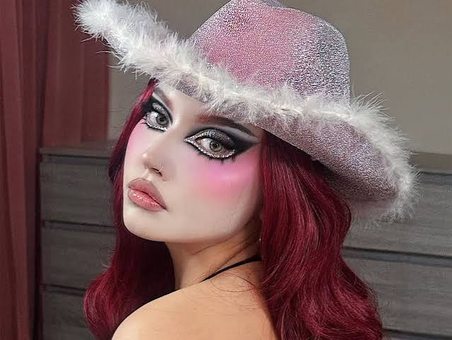
A character feels convincing when each visual choice supports another. Makeup therefore needs to follow the costume’s mood, colors, and personality. Good Halloween makeup starts with the character rather than individual products. A vampire, porcelain doll, forest spirit, or futuristic figure each needs a different finish. Once the concept feels clear, product choices become easier. Colors, textures, coverage, and tools can then work together naturally.
Start With The Character’s Visual Identity
Every character carries a visual mood before makeup begins. Dark shades can suggest mystery, while softer tones create innocence. Texture adds another layer to that impression. A gothic figure might need muted colors and sharp shadows. A playful fairy could use shimmer and rounded details instead. The concept should guide every cosmetic decision.
A useful palette might include:
- Select two main shades first.
- Add one supporting color for depth.
- Repeat accents across facial details.
- Keep costume colors visible nearby.
This approach keeps the face connected with clothing. It also stops unrelated colors from distracting viewers.
Which Finish Matches The Character Best?
Finish changes how skin looks from different distances. Matte products can create dry, aged, or dusty effects. Creamy textures give stronger color and softer blending. Gloss can suggest moisture, slime, or freshly painted surfaces. For Halloween makeup, finish should match the imagined material. A vampire may suit satin skin and dark glossy lips. A stone creature needs flatter textures instead.
The choice also depends on lighting. Reflective products catch light across broad areas. Matte layers preserve stronger shapes under bright conditions. Therefore, the character’s setting deserves attention too.
Coverage Should Follow The Costume
Coverage determines how strongly the concept changes facial appearance. Sheer products work well when natural skin should remain visible. Opaque formulas create a cleaner base for dramatic designs. That difference becomes useful when costumes carry strong visual details.
For example, a haunted doll may need pale, even coverage. A woodland character could keep lighter layers around the cheeks. Meanwhile, a painted creature may require fuller coverage across larger areas.
Several product types can serve different tasks:
- Cream color creates a strong foundation.
- Powder adds controlled depth around edges.
- Pencil products sharpen small facial marks.
- Setting powder reduces unwanted surface shine.
Layering also affects durability. A thin cream base can hold color better when lightly powdered. This method keeps details defined without making the surface feel heavy.
Let The Costume Finish The Story
A porcelain-doll concept shows why coordination matters. Pale coverage establishes an artificial complexion, while rounded blush adds childlike softness. Fine cracks then introduce an unsettling detail without overwhelming the face. The costume can repeat those tones through ribbons, fabric, or accessories.
That connection creates visual continuity. More importantly, it gives each product a clear purpose. Makeup stops functioning as decoration alone. It becomes another part of the character’s storytelling.
When Makeup Starts Carrying Personality
A successful character does not need endless facial detail. A single porcelain crack can matter more than extra decoration. The same principle applies to color, texture, and coverage. When every chosen product supports the character’s personality, the face gains meaning. The result feels designed rather than simply painted, even before the costume’s smallest detail comes into view.
FAQs
What should guide product choices first?
The character concept should determine the palette and finish. Costume colors can then help refine those initial choices.
Which products suit dramatic transformations?
Cream pigments provide stronger coverage for broad changes. Powder products can build shadows and soften harsh edges.
How can the finished look stay cohesive?
Repeating one accent shade can connect separate features. Similar textures also help different areas feel related.
Does every character need heavy coverage?
Not at all, because subtle designs can remain convincing. Product intensity should reflect the character’s intended appearance.