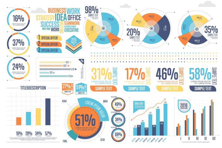
Are you tired of boring content that’s not doing the job? Are you curious about how you can improve yourself as an infographic creator?
Infographics are often the ‘in-between’ content pieces, as they take longer than a blog post and less than a video. Learning everything you can about it, and perfecting your skills, can help you succeed.
Keep reading to find out what common infographic building errors are and how to avoid them!
1. Cluttered Design
Cluttered design is one of the most errors when creating an infographic and one of the most frustrating for viewers. When the infographic looks too busy, it can be hard to understand the message. To avoid this problem, keep it simple by focusing only on the important points you want to emphasize.
Make sure the infographic is organized well and that the text, graphics, and colors don’t overpower each other. Have a consistent font size throughout, and avoid putting too much information into one section or visual. Here’s your solution for stunning and crafting visually appealing infographics with confidence.
2. Poor Color Choices
Poorly chosen colors can distract from the point you are trying to make with the graphic or be too bright and obnoxious. To avoid this, pick a color palette that is limited to two or three colors and then accent with one or two colors, if necessary. When selecting colors, ensure that they are not too dark, too bright, or too close to one another on the color wheel.
Choose colors that go together, such as complementary, analogous, or monochromatic palettes. If you’re unsure, use a color wheel to determine what colors will best bring out the data elements of your graphic. Always use high-quality images to prevent distortion and ensure maximum visibility.
3. Lack of Hierarchy
When hierarchical order is not present, visual confusion may occur because the reader is unable to determine the salient points of the information represented. To avoid this, start by defining the main point of the infographic and then craft the highlights in decreasing order of importance to create a hierarchical structure.
To further emphasize the main point, use a larger font size and bold font for the headline and supporting points. Select based on the context of the information; for example, if you have any supporting points or details, use a smaller font size for those.
4. Inconsistent Typography
Using different types of fonts, sizes, and weights across your design can take away from the overall aesthetic and confuse viewers. To avoid this, it’s necessary to use a specific set of fonts in a limited number of styles throughout the design.
Limit your typefaces to a maximum of three or four, and then ensure that within those typefaces, all the font sizes, weights, and colors remain consistent. A good practice is to unify typefaces by picking a base style, such as a sans serif font, and making sure the type styles used throughout the design is based on this universal font.
Avoiding These Infographic Building Errors Today
Utilizing the advice within this article, such as understanding how to use colors, fonts, and shapes, will help ensure any infographic you create is aesthetically pleasing and leaves a lasting impact. After all, these visuals can ultimately help showcase data and express complicated information in an easily digestible way. Start avoiding these infographic building errors today by following industry-standard advice.
We’re waiting to help you out when you need to build a graphic. Check out some of our other posts for more help.


